Seaborn in Python
Introduction to Seaborn in Python
Seaborn is a powerful visualization library built on top of Matplotlib that makes it easier to create aesthetically pleasing
and informative statistical plots. It integrates well with pandas DataFrames and provides high-level functions to create common
visualizations like bar plots, scatter plots, box plots, heatmaps, and more.
Installation
To install Seaborn, you can use pip:
pip install seaborn
Importing Seaborn
Import Seaborn and other libraries:
import seaborn as sns
import matplotlib.pyplot as plt
Basic Plots in Seaborn
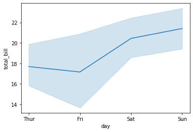
- Line Plot A line plot is used to show the relationship between two continuous variables.
import seaborn as sns
import matplotlib.pyplot as plt

# Load example dataset
tips = sns.load_dataset("tips")

# Create a line plot
sns.lineplot(x="day", y="total_bill", data=tips)

# Display the plot
plt.show()
Note: "According to the tips dataset documentation, the Tips dataset is a data frame with 244 rows and 7 variables which represents some tipping data where one waiter recorded information about each tip he received over a period of a few months working in one restaurant."
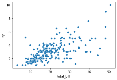
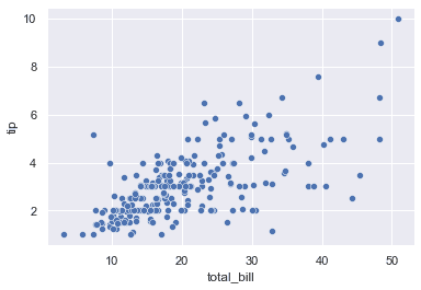
- Scatter Plot A scatter plot is used to display the relationship between two continuous variables.
sns.scatterplot(x="total_bill", y="tip", data=tips)

plt.show()
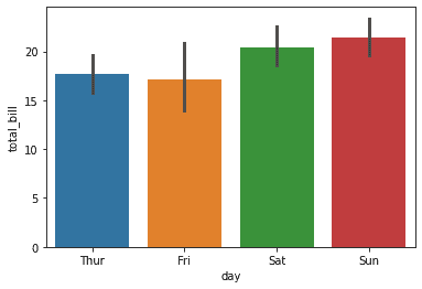
- Bar Plot A bar plot is used to compare quantities for different categories.
sns.barplot(x="day", y="total_bill", data=tips)

plt.show()
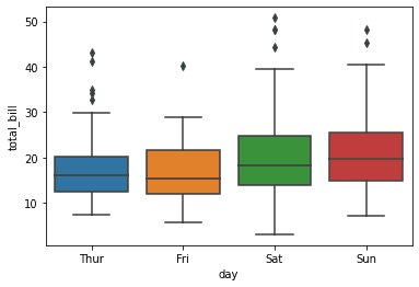
- Box Plot A box plot shows the distribution of a dataset based on a five-number summary (minimum, first quartile, median, third quartile, and maximum).
sns.boxplot(x="day", y="total_bill", data=tips)

plt.show()
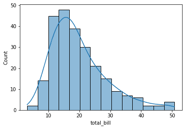
- Histogram A histogram is used to show the distribution of a dataset.
sns.histplot(tips['total_bill'], kde=True)  # Including kernel density estimate (KDE)

plt.show()
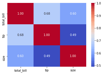
- Heatmap A heatmap is used to visualize data in matrix format, where values are represented by color intensity.
import numpy as np

# Create a correlation matrix
corr = tips.corr()

# Create a heatmap
sns.heatmap(corr, annot=True, cmap="coolwarm", fmt=".2f")

plt.show()
Customizing Seaborn Plots
Seaborn allows you to easily customize your plots using various parameters.
- Customizing Colors You can customize the color palette to make the plot more attractive.
# Use a predefined color palette
sns.set_palette("darkgrid")

sns.scatterplot(x="total_bill", y="tip", data=tips)

plt.show()
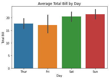
- Adding Titles and Labels You can add titles, axis labels, and adjust the plot size.
sns.barplot(x="day", y="total_bill", data=tips)

# Add title and labels
plt.title("Average Total Bill by Day")
plt.xlabel("Day")
plt.ylabel("Total Bill")

plt.show()
Seaborn Themes
Seaborn provides several themes for controlling the style of the plots.
-
darkgrid: Gray background with gridlines.
-
whitegrid: White background with gridlines.
-
dark: Dark background with no gridlines.
-
white: White background with no gridlines.
-
ticks: White background with ticks on the axes.
-
Using Themes
# Set the style to darkgrid
sns.set_theme(style="darkgrid")

# Create a plot
sns.scatterplot(x="total_bill", y="tip", data=tips)

plt.show()
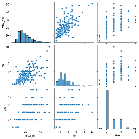
Pair Plot
A pair plot allows you to visualize relationships between multiple variables in a dataset.
sns.pairplot(tips)

plt.show()
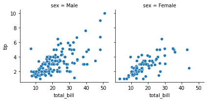
FacetGrid
FacetGrid allows you to create multiple subplots based on some categorical variable.
# Create FacetGrid based on the "sex" column
g = sns.FacetGrid(tips, col="sex")
g.map(sns.scatterplot, "total_bill", "tip")

plt.show()
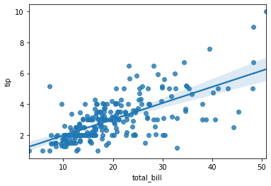
Regression Plot
A regression plot shows the relationship between two variables and fits a regression line.
sns.regplot(x="total_bill", y="tip", data=tips)

plt.show()
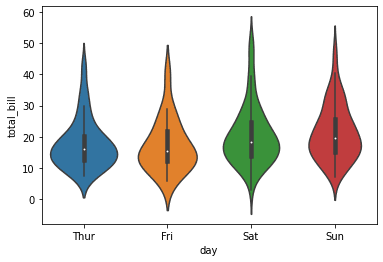
Violin Plot
A violin plot combines aspects of box plots and density plots. It shows the distribution of the data across different categories.
sns.violinplot(x="day", y="total_bill", data=tips)

plt.show()
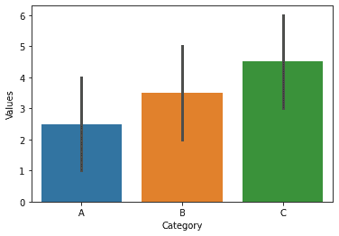
Seaborn with Pandas DataFrames
Seaborn works seamlessly with pandas DataFrames, and it's easy to pass data directly from pandas to Seaborn functions.
import seaborn as sns
import pandas as pd

# Create a pandas DataFrame
df = pd.DataFrame({
    'Category': ['A', 'B', 'C', 'A', 'B', 'C'],
    'Values': [1, 2, 3, 4, 5, 6]
})

# Create a bar plot directly from the DataFrame
sns.barplot(x='Category', y='Values', data=df)

plt.show()
Saving Seaborn Plots
You can save your Seaborn plots as image files (e.g., PNG, SVG) using Matplotlib.
# Create a bar plot
sns.barplot(x="day", y="total_bill", data=tips)

# Save the plot as PNG
plt.savefig("seaborn_plot.png")

# Show the plot
plt.show()

Key Seaborn Plots
- Line Plot: Shows relationships between continuous variables.
- Bar Plot: Compares quantities across categories.
- Scatter Plot: Displays relationships between two variables.
- Box Plot: Shows data distribution based on percentiles.
- Histogram: Displays the distribution of a single variable.
- Heatmap: Visualizes matrix-like data.
- Pair Plot: Visualizes relationships between multiple variables.
- FacetGrid: Creates subplots based on categories.
- Regression Plot: Plots data with a fitted regression line.
- Violin Plot: Displays data distribution and density.