Matplotlib in Python
Introduction to Matplotlib
Matplotlib is one of the most popular and versatile libraries for creating static, animated, and interactive visualizations in
Python. It's used to produce high-quality figures that can be customized in many ways.
Basic Plotting with Matplotlib
Matplotlib provides a simple interface to create a wide range of plots, including line plots, bar plots, scatter plots, and histograms.
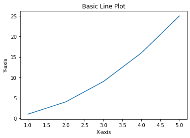
- Basic Line Plot
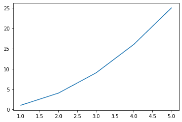
import matplotlib.pyplot as plt

# Data
x = [1, 2, 3, 4, 5]
y = [1, 4, 9, 16, 25]

# Create a line plot
plt.plot(x, y)
plt.xlabel('X-axis')
plt.ylabel('Y-axis')
plt.title('Basic Line Plot')
plt.show()
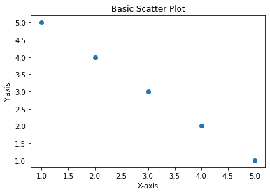
- Basic Scatter Plot
import matplotlib.pyplot as plt

# Data
x = [1, 2, 3, 4, 5]
y = [5, 4, 3, 2, 1]

# Create a scatter plot
plt.scatter(x, y)
plt.xlabel('X-axis')
plt.ylabel('Y-axis')
plt.title('Basic Scatter Plot')
plt.show()
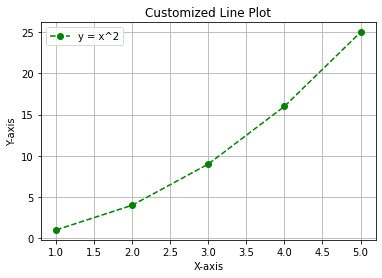
Customizing Plots
Matplotlib allows you to fully customize your plots, including colors, styles, markers, and more.
- Customized Line Plot
import matplotlib.pyplot as plt

# Data
x = [1, 2, 3, 4, 5]
y = [1, 4, 9, 16, 25]

# Customize the plot
plt.plot(x, y, label='y = x^2', color='green', linestyle='--', marker='o')

# Add labels and title
plt.xlabel('X-axis')
plt.ylabel('Y-axis')
plt.title('Customized Line Plot')

# Add legend and grid
plt.legend()
plt.grid(True)

plt.show()
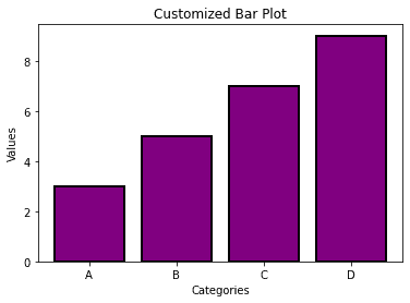
- Bar Plot with Customizations
import matplotlib.pyplot as plt

# Data
x = ['A', 'B', 'C', 'D']
y = [3, 5, 7, 9]

# Create a bar plot with customizations
plt.bar(x, y, color='purple', edgecolor='black', linewidth=2)

# Add title and labels
plt.title('Customized Bar Plot')
plt.xlabel('Categories')
plt.ylabel('Values')

plt.show()
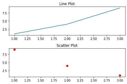
Subplots: Multiple Plots in One Figure
Matplotlib allows you to create multiple plots within a single figure using subplots().
- Creating Subplots
import matplotlib.pyplot as plt

# Create a figure and axes (2 rows, 1 column)
fig, axs = plt.subplots(2, 1)

# Line plot in the first subplot
axs[0].plot([1, 2, 3], [1, 4, 9], label='Line plot')
axs[0].set_title('Line Plot')

# Scatter plot in the second subplot
axs[1].scatter([1, 2, 3], [9, 4, 1], color='red', label='Scatter plot')
axs[1].set_title('Scatter Plot')

# Display the plots
plt.tight_layout()
plt.show()
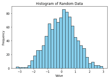
Histogram Plots
Histograms are used to visualize the distribution of a dataset.
- Basic Histogram
import matplotlib.pyplot as plt
import numpy as np

# Random data
data = np.random.randn(1000)

# Create a histogram
plt.hist(data, bins=30, color='skyblue', edgecolor='black')

# Add title and labels
plt.title('Histogram of Random Data')
plt.xlabel('Value')
plt.ylabel('Frequency')

plt.show()
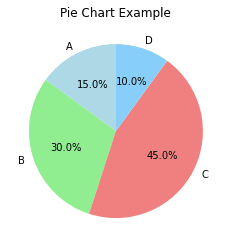
Pie Charts
Pie charts are useful for showing the relative proportions of categories in a dataset.
- Pie Chart
import matplotlib.pyplot as plt

# Data
labels = ['A', 'B', 'C', 'D']
sizes = [15, 30, 45, 10]

# Create a pie chart
plt.pie(sizes, labels=labels, autopct='%1.1f%%', startangle=90, colors=['lightblue', 'lightgreen', 'lightcoral', 'lightskyblue'])

# Add title
plt.title('Pie Chart Example')

plt.show()
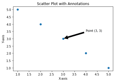
Scatter Plots with Annotations
You can add annotations to your scatter plot to highlight specific points or areas.
- Scatter Plot with Annotations
import matplotlib.pyplot as plt

# Data
x = [1, 2, 3, 4, 5]
y = [5, 4, 3, 2, 1]

# Create a scatter plot
plt.scatter(x, y)

# Annotate a point
plt.annotate('Point (3, 3)', xy=(3, 3), xytext=(4, 3.5),
             arrowprops=dict(facecolor='black', shrink=0.05))

# Add labels and title
plt.xlabel('X-axis')
plt.ylabel('Y-axis')
plt.title('Scatter Plot with Annotations')

plt.show()
Saving Figures to Files
You can save your plots to various file formats like PNG, PDF, or SVG using the savefig() function.
- Saving a Plot
import matplotlib.pyplot as plt

# Data
x = [1, 2, 3, 4, 5]
y = [1, 4, 9, 16, 25]

# Create a line plot
plt.plot(x, y)

# Save the plot as a PNG image
plt.savefig('line_plot.png')

# Show the plot
plt.show()
Key Customizations in Matplotlib
- Labels & Titles:
plt.xlabel(),plt.ylabel(),plt.title() - Legends:
plt.legend() - Grid:
plt.grid() - Color and Style:
color,linewidth,linestyle,marker - Subplots:
plt.subplots()for multiple plots - Saving:
plt.savefig('filename')